Typology
The Tactile Edit
Beyond the surface. The logic of ingredients.
Case StudyTypology disrupted the beauty market with a radical promise: transparency and a maximum of ten ingredients. However, in a digital landscape flooded with "clean beauty" aesthetics, the challenge was to evolve the visual language from "informative and minimal" to "iconic and authoritative." We needed to prove that simplicity isn't just a lack of ingredients – it’s a deliberate design choice.
The modern consumer is exhausted by over-designed packaging and empty marketing prose. By stripping away the "lifestyle noise" and focusing on the raw materiality – the glass, the oil, the skin – we create a visual honesty that builds immediate trust. We don't sell "beauty"; we sell the logic of the essential.
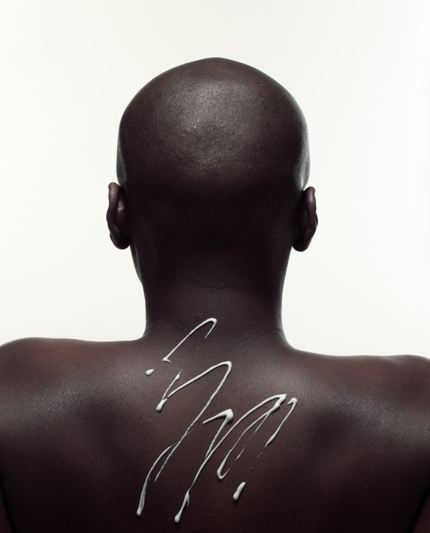
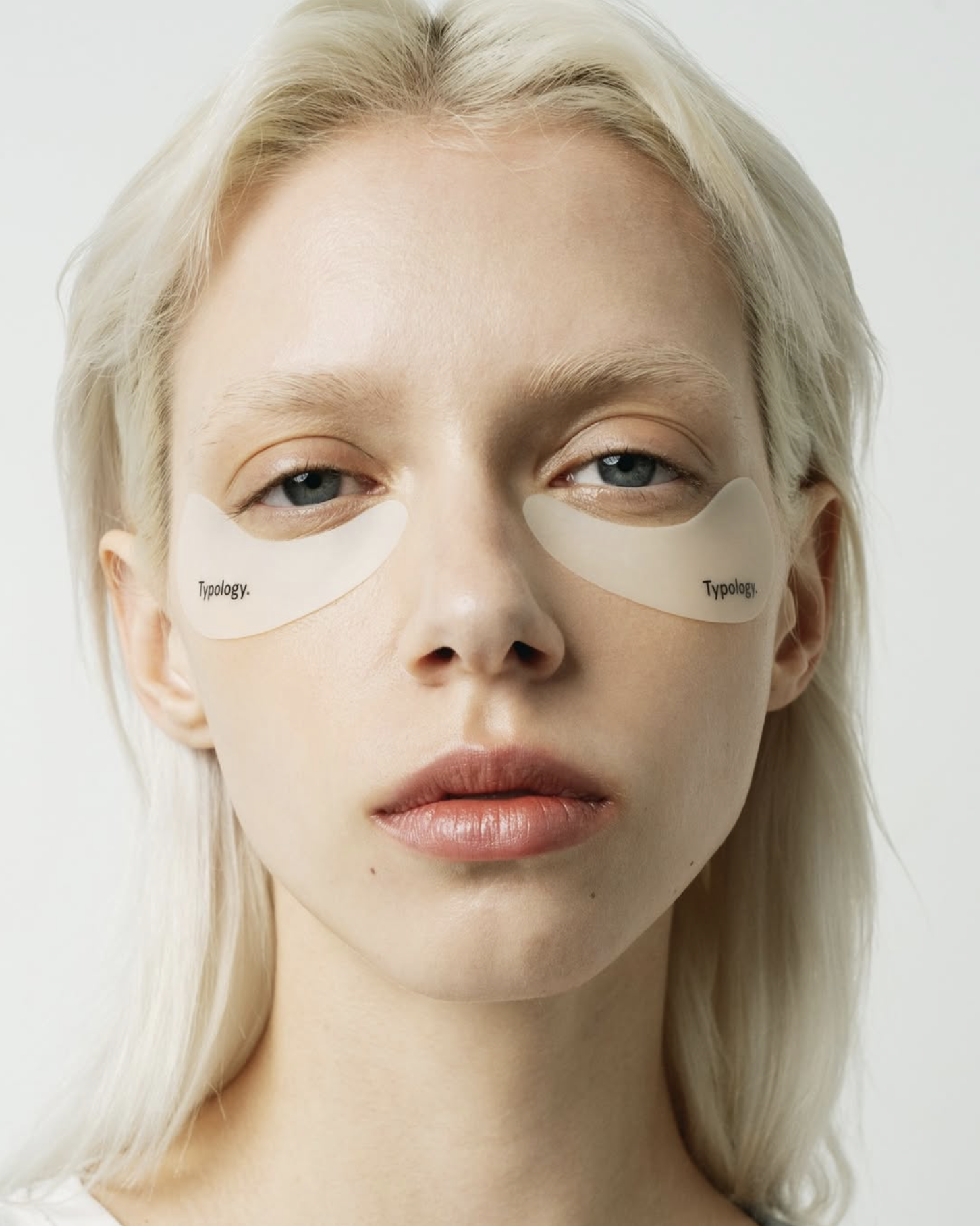
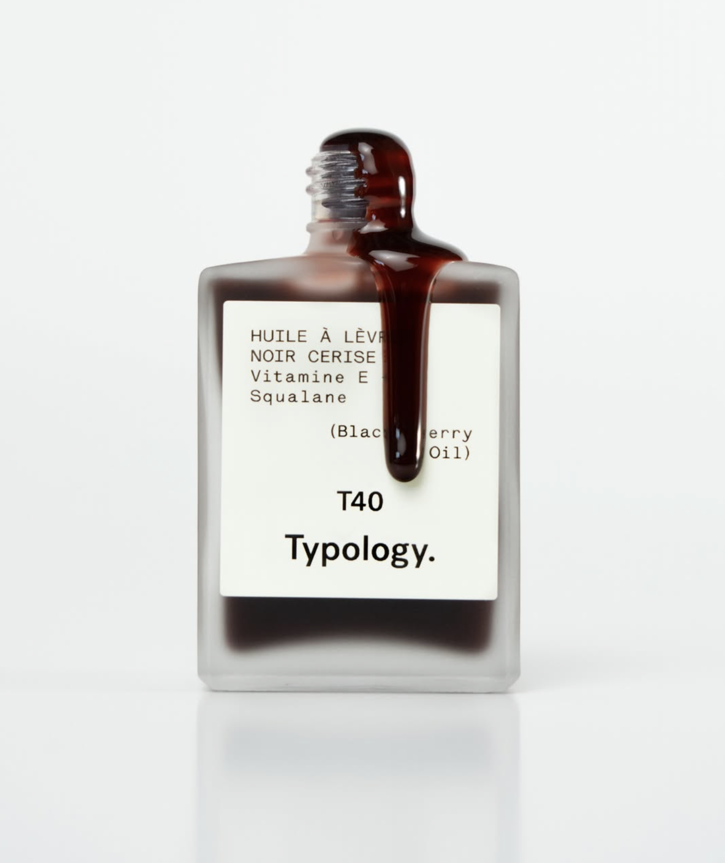
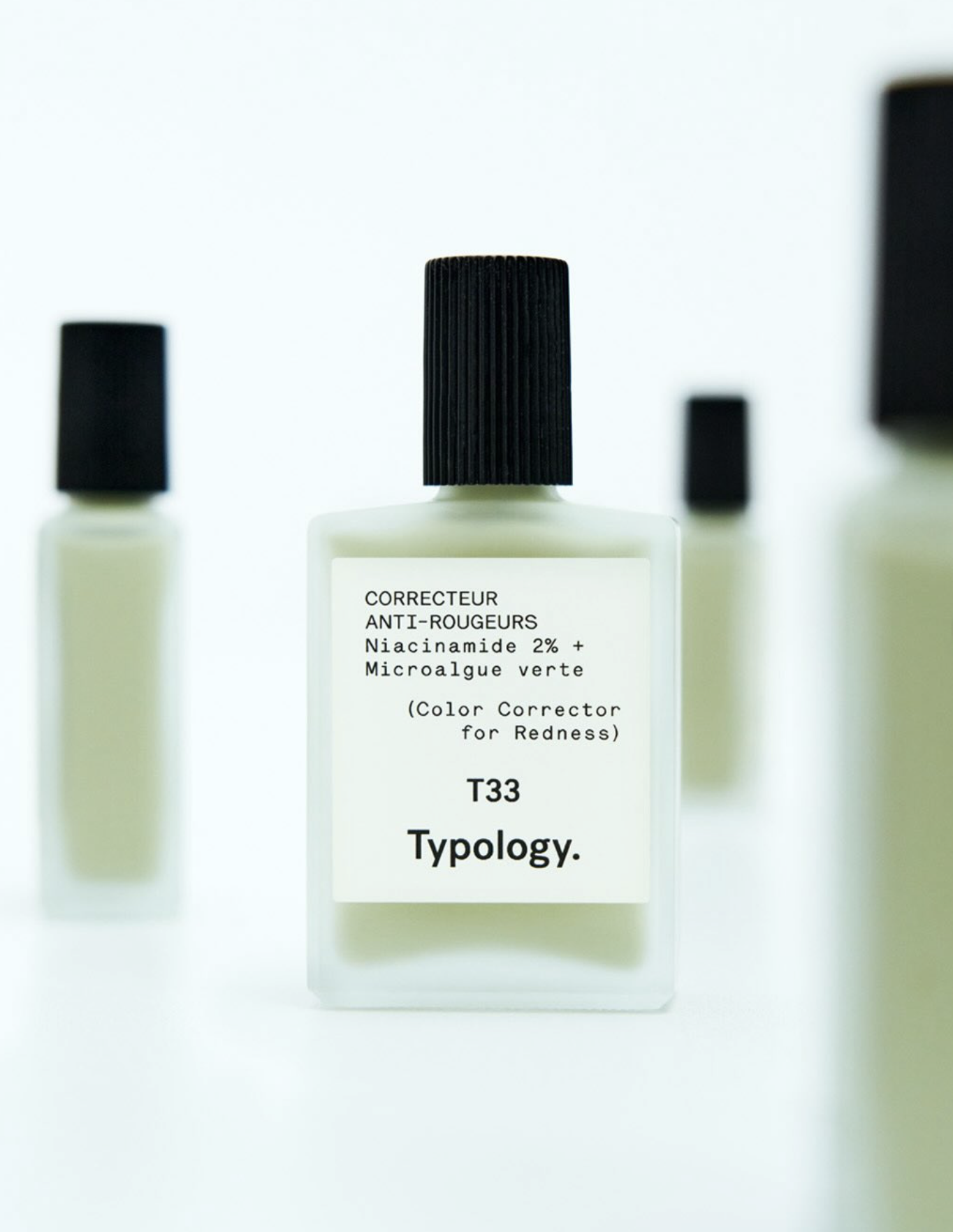
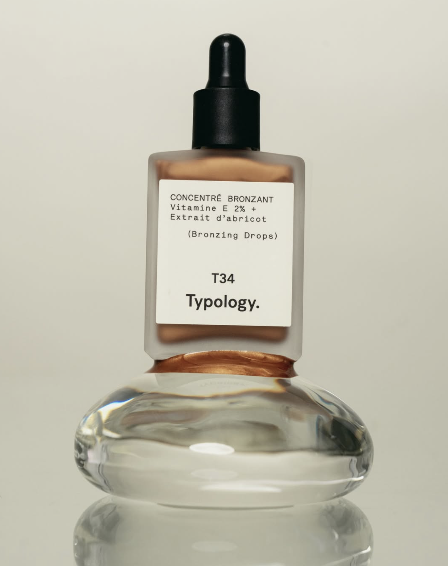
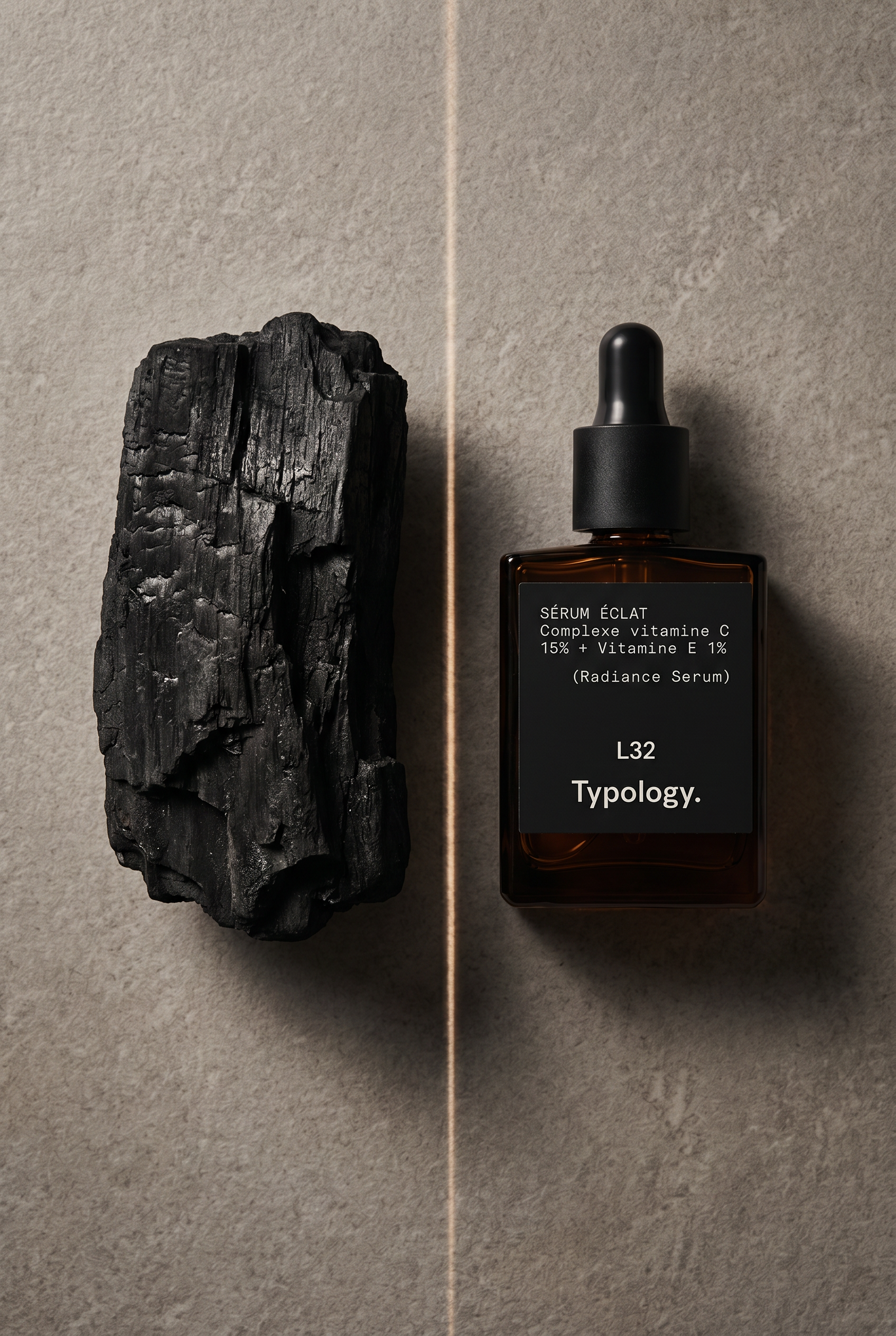
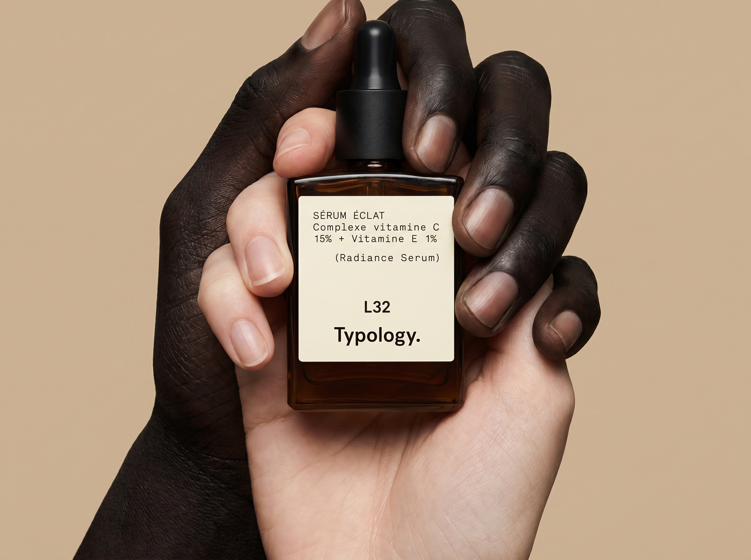
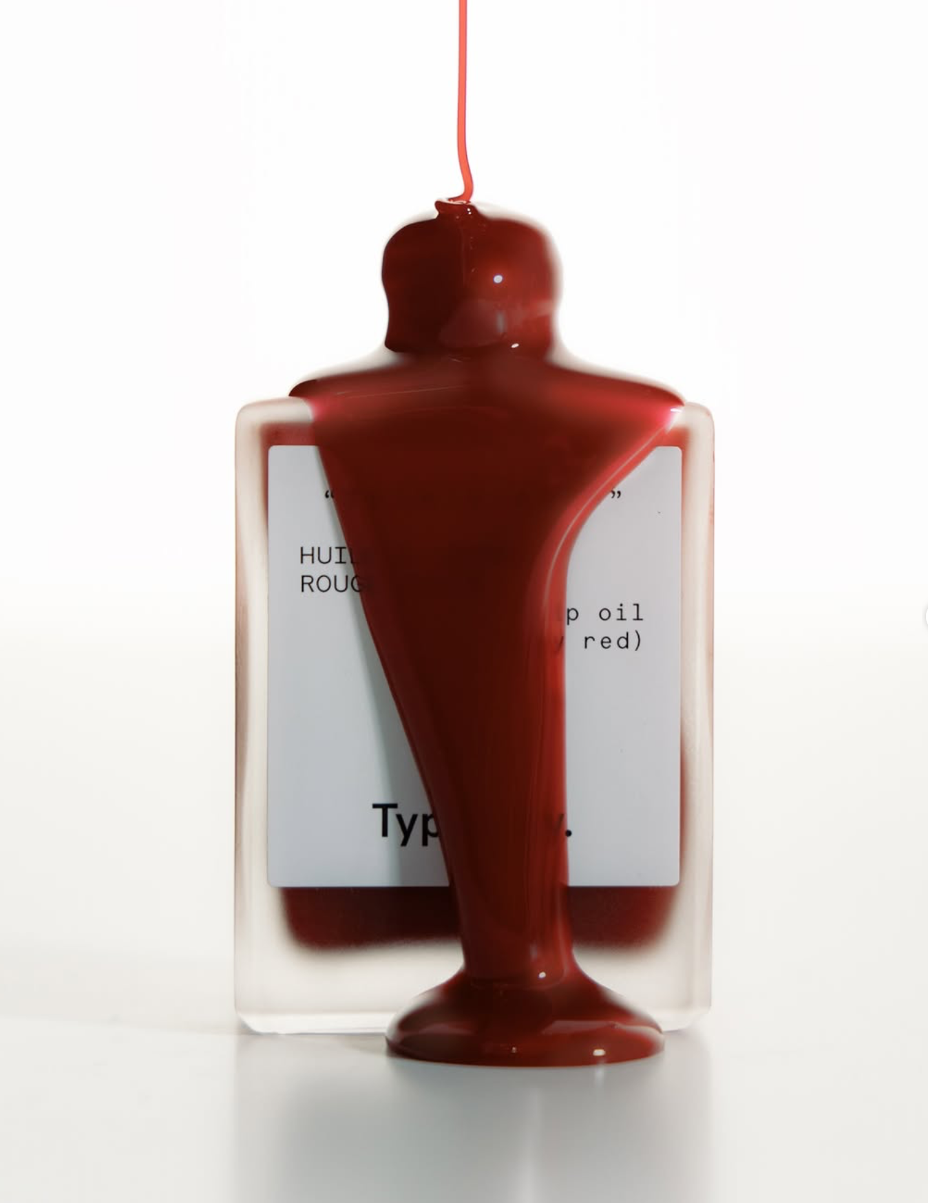
We treat the product as a surgical tool. The campaign philosophy follows a strict "Reduce to the Max" approach. Every frame is a study in Materiality: the tension of a droplet, the weight of the glass flacon, and the texture of the skin. It’s an aesthetic of "Quiet Authority" – where the vacuum of the space emphasizes the potency of the formula.
Inspired by the Typology DNA, we evolved the visual system into a more disciplined, high-end editorial look:
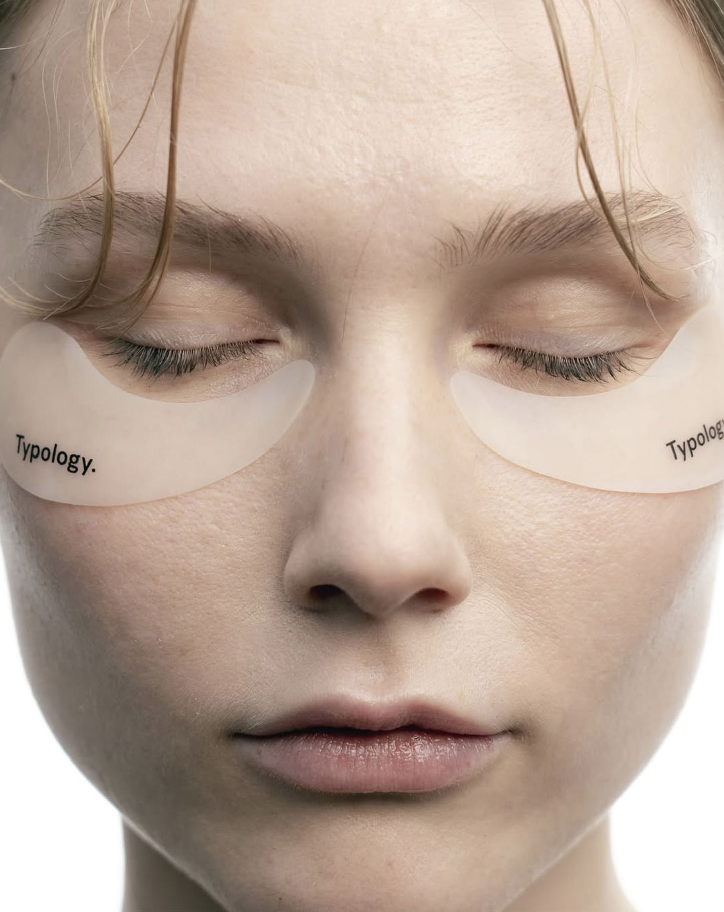
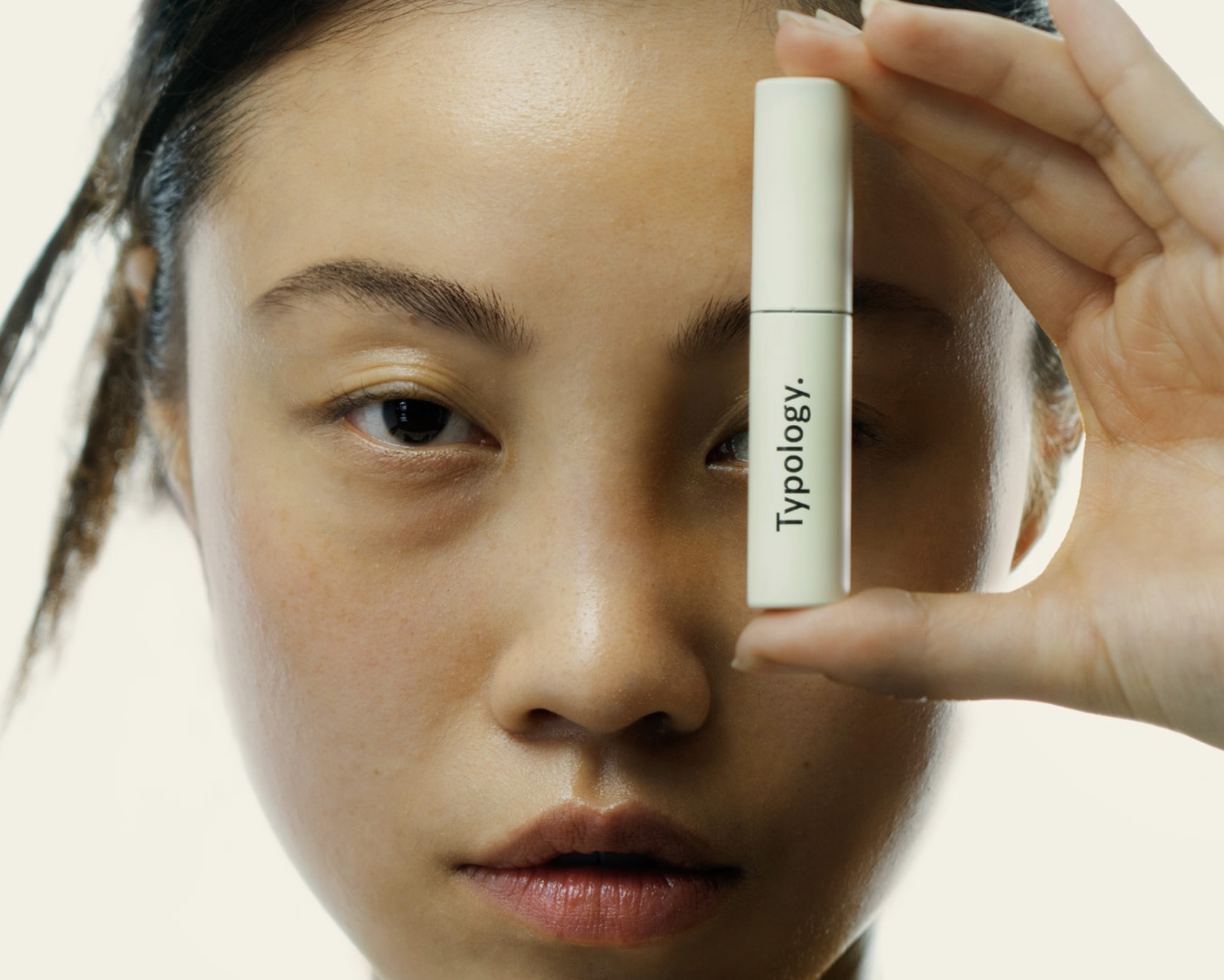
The Human Interface: Moving away from traditional "smiling faces" to structural shots of hands and skin. The hand becomes a pedestal, a tool of precision.
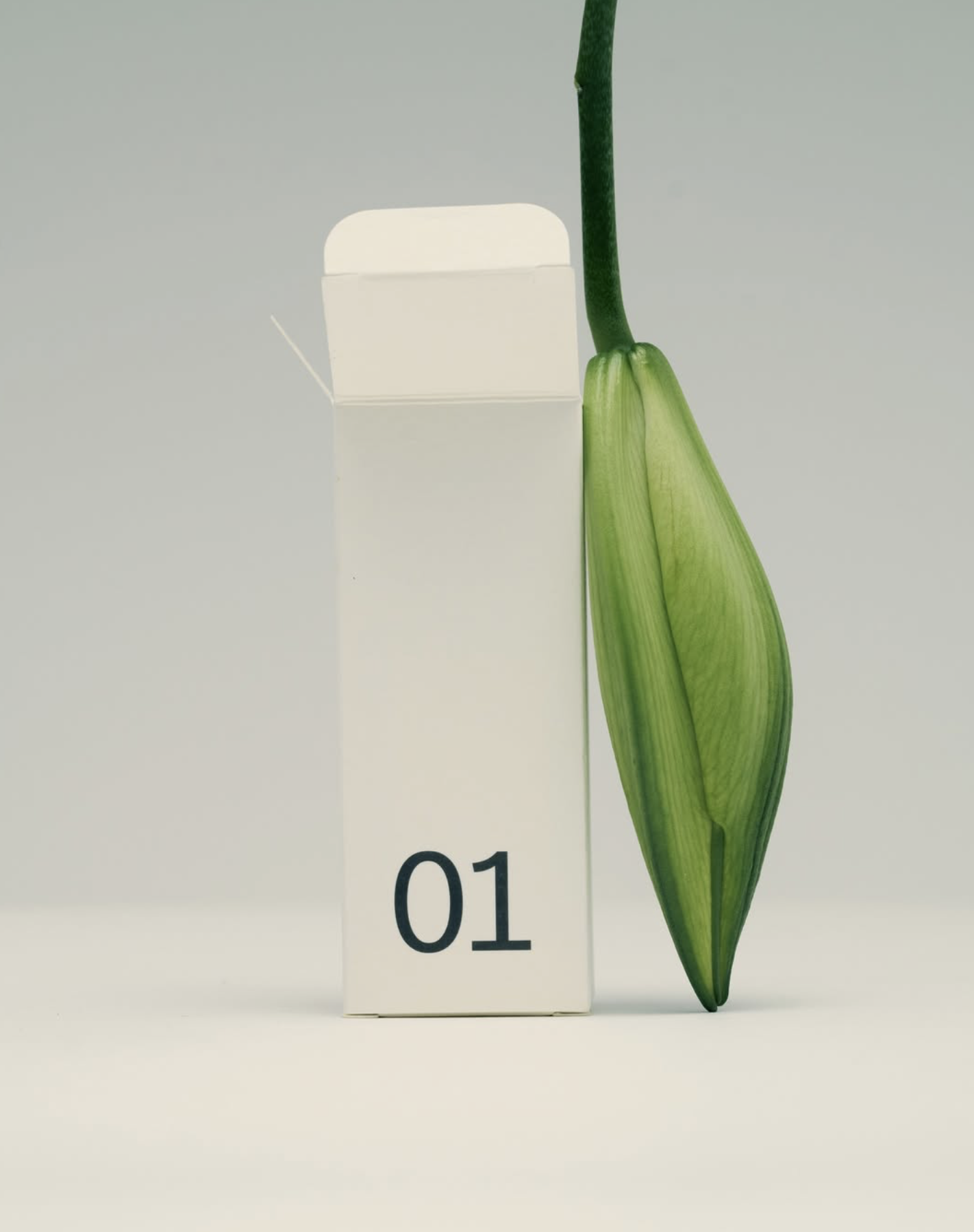
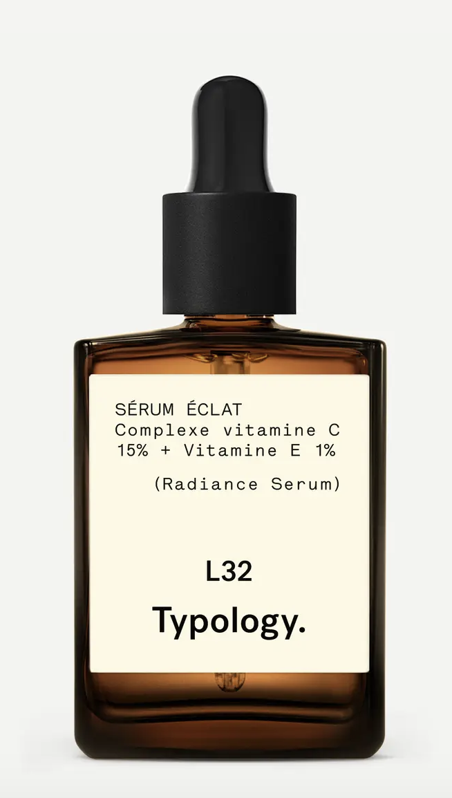
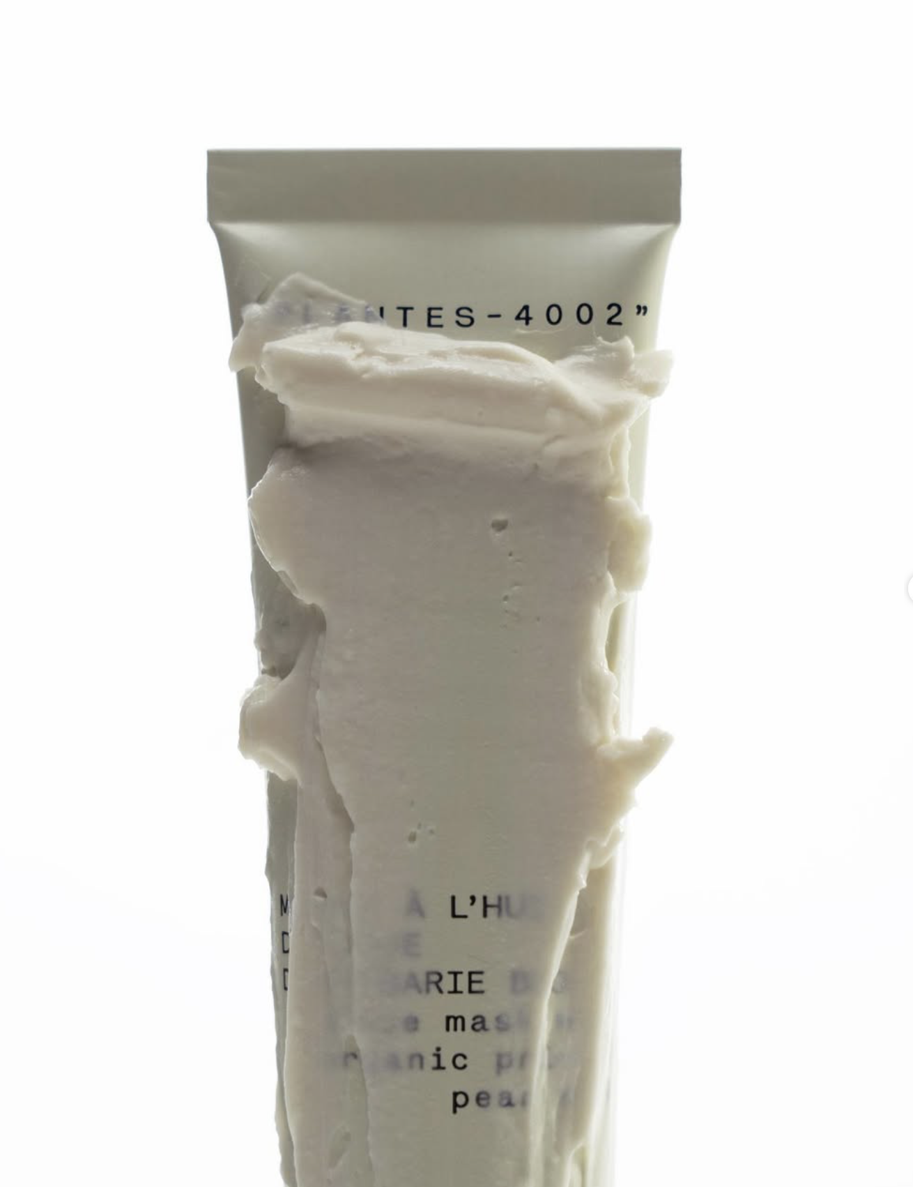
Macro Materiality: Extreme close-ups of raw ingredients (a single botanical leaf, a piece of charcoal, a drop of salicylic acid) contrasted with the clinical perfection of the bottle.
The Shadow Grid: Using sharp, directional light to create geometric shapes on a neutral, desaturated palette (sand, bone, stone).
1. The Challenge
2. The Strategic Insight

3. The Big Idea
4. Visual Language: Tactile Minimalism

My role was to curate the transition from a "D2C-Brand" to a "Design Authority":
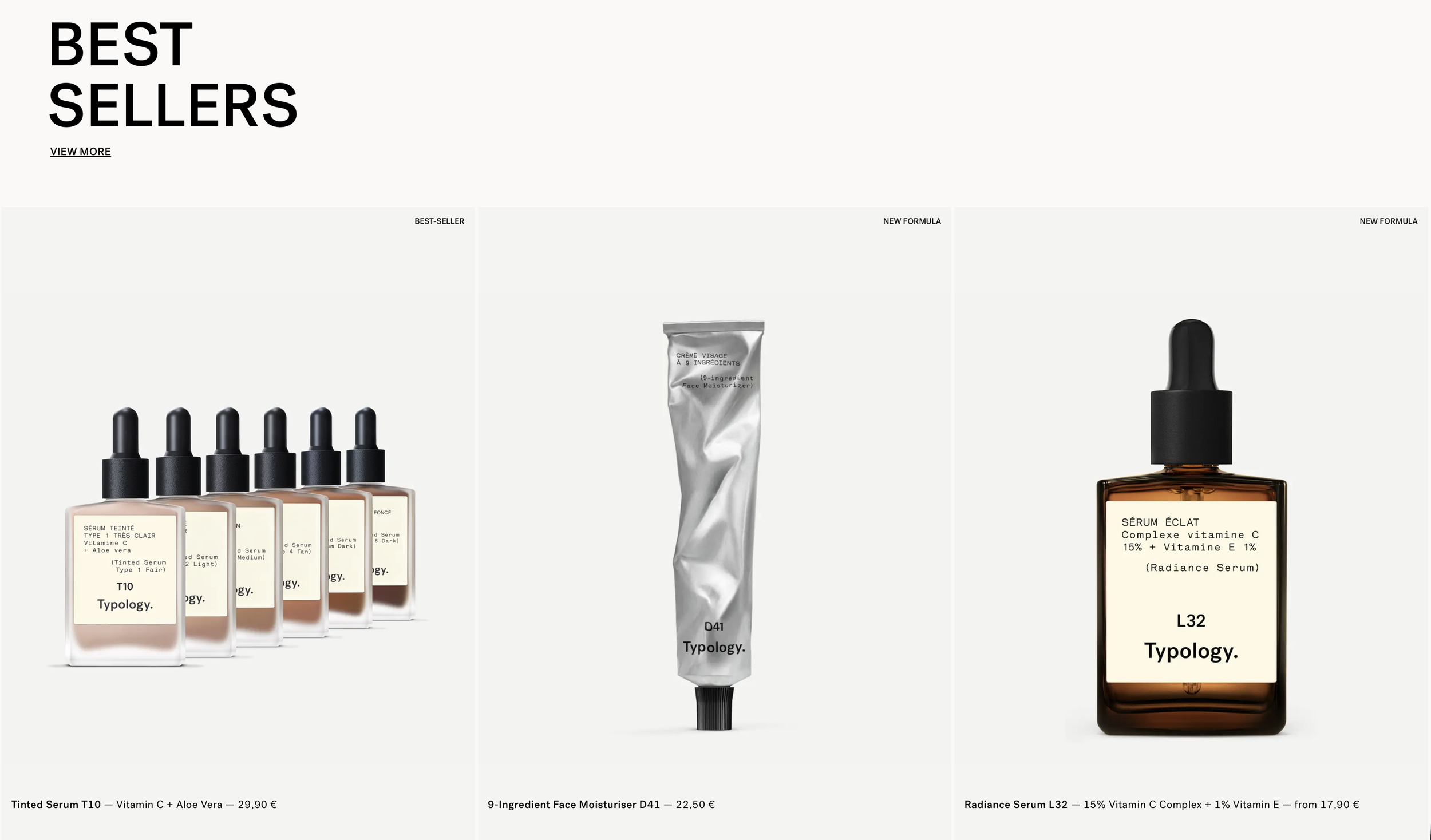
Content Orchestration: Developing a visual grid that functions as a continuous narrative, balancing product-focus with abstract textural studies.
Aesthetic Discipline: Enforcing a radical color-code and lighting-manual to ensure global brand consistency across all digital touchpoints.
Strategic Consulting: Aligning the B-Corp values with a high-end visual output, proving that sustainability and luxury minimalism are the same side of the coin.
5. Creative Lead & Strategic Orchestration
The repositioning transformed Typology’s visual presence into a strategic asset that amplifies its B–Corp values through pure design:
Intellectual Ownership: Typology successfully occupied the „Surgical Minimalism“ niche, separating itself from the cluttered „Natural Beauty“ market and attracting a high-value, design-conscious demographic.
B-Corp Visual Logic: The radical visual honesty directly amplified the brand’s transparency claims. By removing decorative noise, we increased consumer trust, resulting in a measurable rise in brand loyalty and editorial interest from premium design publications.
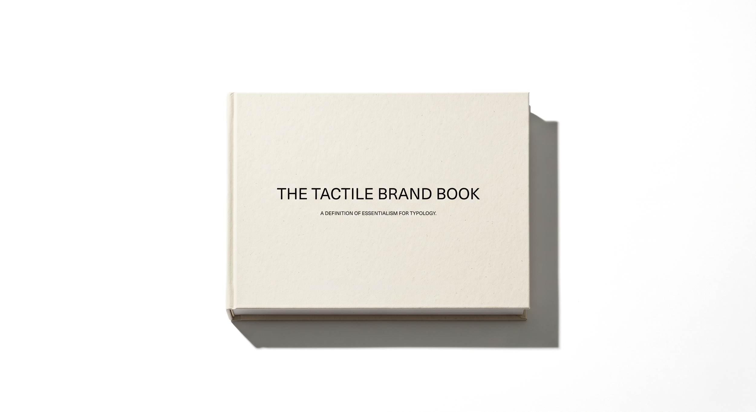
The 360° Ecosystem: The project delivered a comprehensive asset library and systems designed for longevity, like The Tactile Brand Book: A 120–page digital and print style guide defining the new standards for skin texture, macro-lighting, and negative space.
6. The Impact